Carnegie Mellon University:
Science Department Icons


Opportunity
Carnegie Mellon University’s Mellon College of Science needed new ways to visually distinguish between its four departments: Biological sciences, Chemistry, Mathematical sciences, and Physics. The goal was to design a set of icons, both still and animated, that clearly represented the four departments of the science college, while aligning with the broader CMU brand. The previous visuals in use were not scalable, lacked consistency across digital and print materials, and were inconsistent with CMU’s broader brand style guide.
Action
I started by reviewing the old icons and collaborating with the communications team to identify key issues. After gathering feedback from faculty and staff about the existing designs, I developed a visual style for the new icons. I created initial drafts, incorporating feedback from each department, and refined the designs based on their input. After final adjustments, the icons were approved and integrated into the CMU MCS website.
Challenges
Not *technically* branding
Any creative assets within a CMU Department or College could not present new “branding”, per university marketing guidelines. So, these icons needed to complement current CMU branding, without seeming to replace or stand-in for it. The icons needed to maintain a balance of distinct identity while standing to the side of CMU unitmarks and wordmarks.
Distilling down to basics
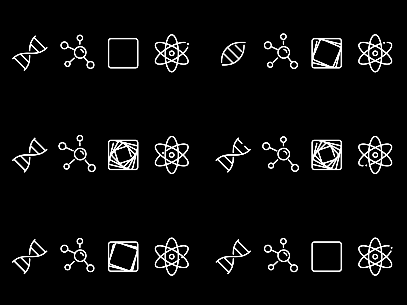
There are an overwhelming amount of subjects within each department study area, yet the goal was to identify each by a simple visual. This meant having to identify a core, unifying quality within each departmental subject. What, exactly, is physics? Is it the movement of a ball down a slope, or ripples in spacetime? I referred back to the basic definitions of each scientific field in order to define a unifying concept for each. I was then able to define that simple theme in a visual, creating the icons. Biological Sciences, the studies of living things was represented by DNA’s double-helix structure. Chemistry, the identification of matter’s most basic substances shown by a molecule. Mathematical Sciences — an abstract study of number, quantity, and space, broken down into an infinitely looping fractal. Physics, the study of matter and energy — broken down into the dynamic atom.
Solution
The project resulted in four custom icons — one for each department. Each icon symbolized its department’s focus: a double helix for Biology, a molecular structure for Chemistry, infinity fractal for Math, and an atom for Physics.
A key decision was whether to assign unique colors to each department. Ultimately, we chose to maintain a consistent color palette across all icons to avoid clashing with CMU’s signature Carnegie Red and to ensure flexibility for future use.
The icons were approved by CMU’s marketing team and implemented across the MCS website, as well as on customized templates for faculty business cards and letterheads.
This project reinforced the importance of simplicity. By streamlining the design, reducing color variations, and aligning with CMU's brand, I created clear, cohesive icons that effectively represented each department's identity.
